Interpreting Covariate Importance
DAME-FLAME is an interpretable matching package because it allows users to quickly and easily understand which covariates were selected to be important to their outcome.
This can be useful in determining who benefits from treatment the most and where resources should be spent for future treatment.
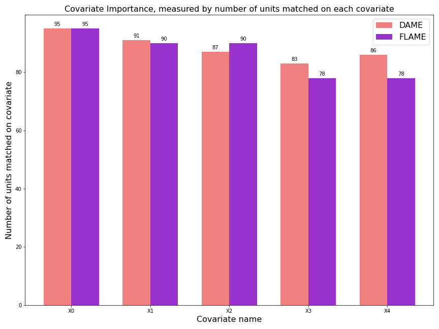
In this example, using the verbose==3 option, we show how to view the iterations of the algorithm and infer the best covariates. We begin with a simulated dataset in which four covariates are labelled 0 to 3, and the covariates are of exponentially decreasing importance to the outcome as the label number increases.
We see from the output that the FLAME algorithm drops unimportant covariates earlier in its algorithm. At each iteration of the FLAME algorithm, FLAME drops the least important covariate.
In this example, we also graph the number of units that were placed in a matched group based on each covariate. You can see that most units were matched using the most important covariate, and the least important covariate is used in comparatively fewer matches.
import dame_flame
import numpy as np
import matplotlib.pyplot as plt


df,_ = dame_flame.utils.data.generate_binomial_decay_importance(50,50)

model = dame_flame.matching.FLAME(verbose=3, repeats=False)
model.fit(holdout_data=df)
result_flame = model.predict(df)
# Get matches using DAME and FLAME
model_dame = dame_flame.matching.DAME(repeats=False)
model_dame.fit(holdout_data=df)
result_dame = model_dame.predict(df)

# replace all the '*'s with NAs so we can get a count of the NAs.
result_flame = result_flame.replace(to_replace='*', value=np.nan)
result_dame = result_dame.replace(to_replace='*', value=np.nan)

# rename columns for graph
X_columns = ["X" + col for col in result_flame.columns]
result_flame.columns = X_columns
result_dame.columns = X_columns

x = np.arange(len(result_flame.columns))  # the label locations
width = 0.35  # the width of the bars

f, ax = plt.subplots(figsize=(12,9))
rects1 = ax.bar(x - width/2,  result_dame.count(axis=0), width, color="lightcoral", label = "DAME" ) #, stopping at {}% control units matched".format(percent), hatch="/")
rects2 = ax.bar(x + width/2, result_flame.count(axis=0), width, color = "darkorchid", label = "FLAME") #, stopping at {}% control units matched".format(percent), hatch = "\\")
ax.set_ylabel('Number of units matched on covariate', fontsize=16)
ax.set_xlabel('Covariate name', fontsize=16)
ax.set_title('Covariate Importance, measured by number of units matched on each covariate', fontsize=16)

ax.set_xticks(x)
ax.set_xticklabels(result_flame.columns)
ax.legend(fontsize=16)

def autolabel(rects):
    """Attach a text label above each bar in *rects*, displaying its height."""
    for rect in rects:
        height = rect.get_height()
        ax.annotate('{}'.format(height),
                    xy=(rect.get_x() + rect.get_width() / 2, height),
                    xytext=(0, 3),  # 3 points vertical offset
                    textcoords="offset points",
                    ha='center', va='bottom')


autolabel(rects1)
autolabel(rects2)

f.tight_layout()

plt.savefig('interpretability.png')
